Viral
Narjas Zatat
May 10, 2016

Robert Peston's new ITV show attracted 166,000 viewers on Sunday, and you can bet that at least half tuned in after they saw the show logo’s unfortunate likeness to male genitalia.
Ok, maybe not, but just in case you forgot, here it is in all its, um, glory:
In light of this eyebrow-raising effort, here are 17 other times over the years graphic design departments got it wrong:
1. The iSmart logo
The company were quick to redesign the logo but it was too late - the Viral Fairy got to it first.
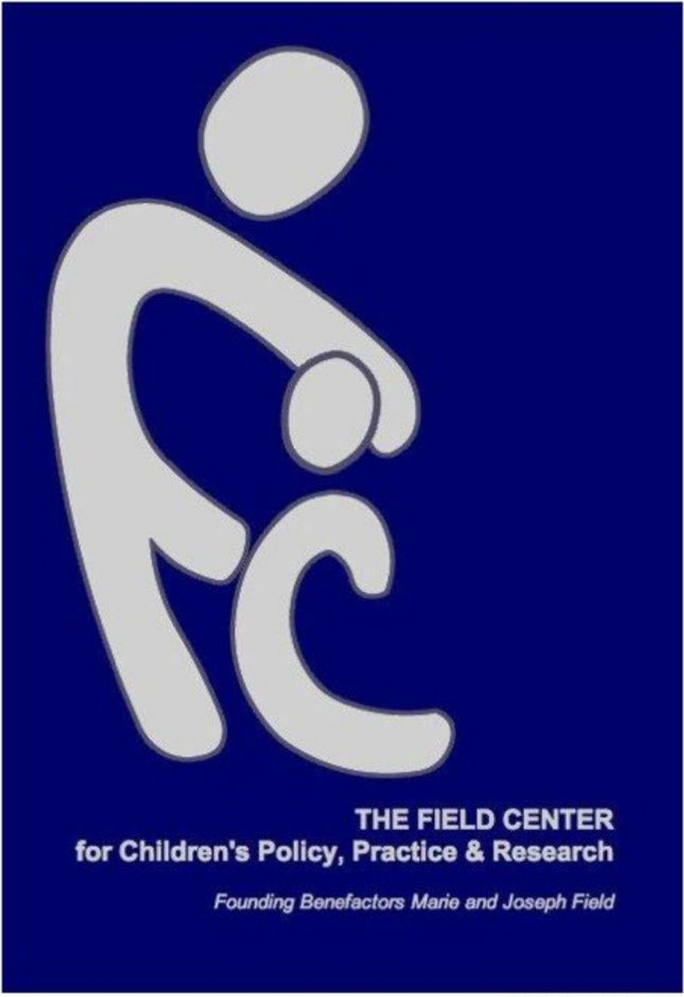
2. Penn Field’s Centre for Children’s Policy, Practise & Research
It's since been changed, but someone must have got into a lot of trouble for this design.
A lot of trouble.
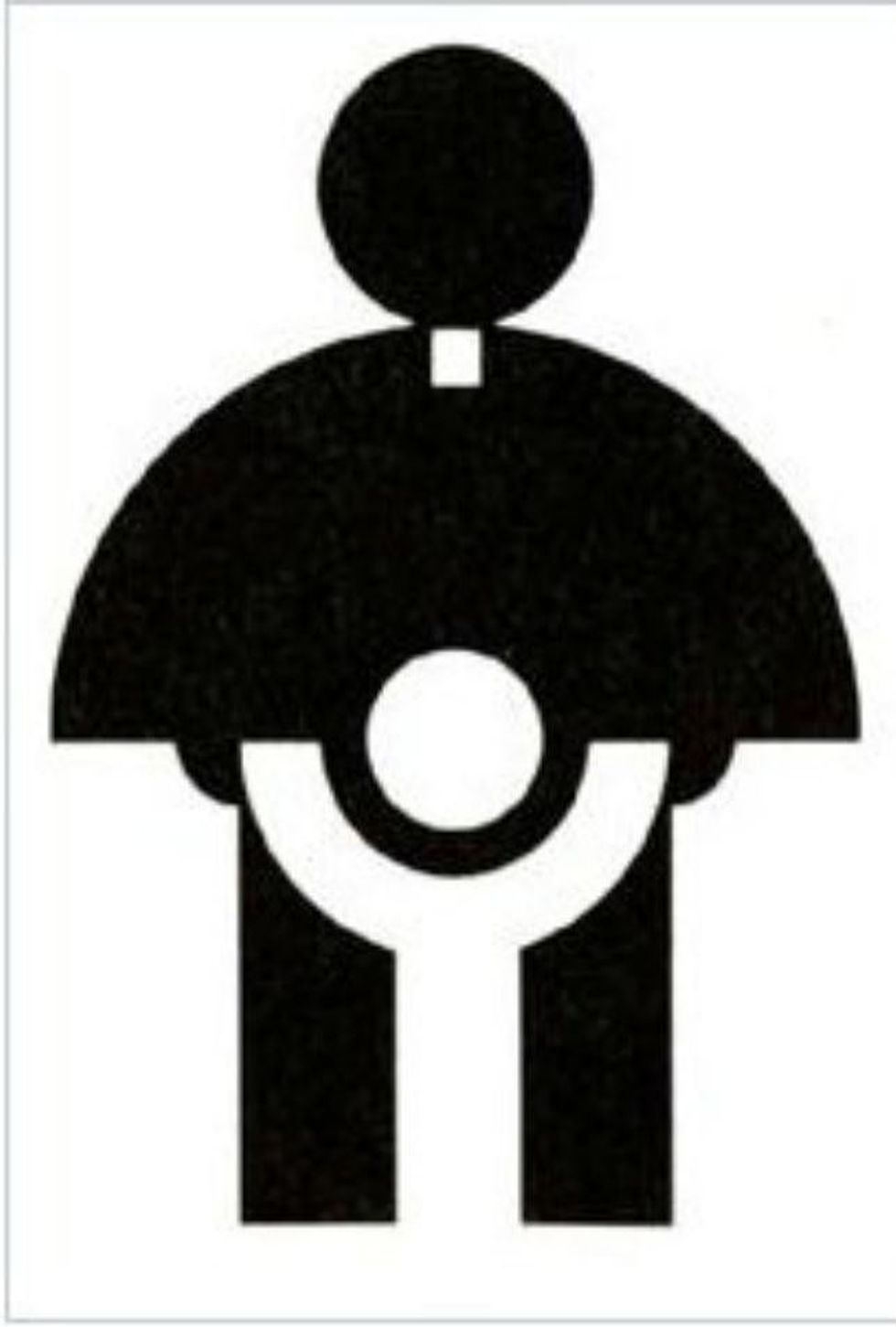
3. Catholic Church’s Archdiocesan Youth Commission
Supposedly, back in 1973 someone designed this logo for a Catholic youth group.
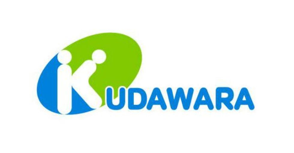
4. Kudawara Pharmacy
How did this get client approval?
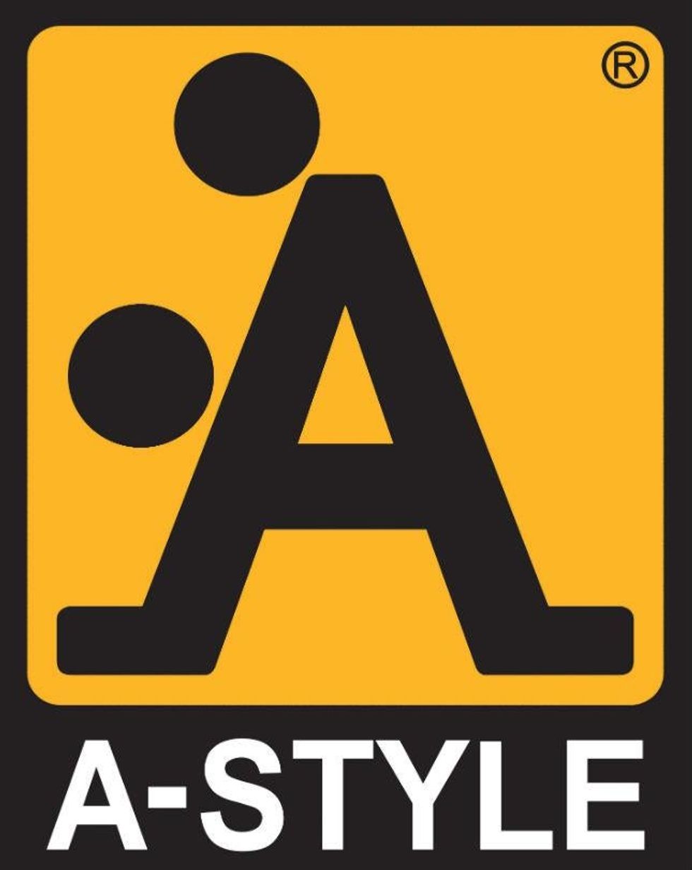
5. A-Style clothing
Apparently this one is deliberate.
6. Deccan Engineering Enterprises
This also continues to be in use...
7. Sherwin Williams
'Cover the Earth' with blood red paint. Sounds goooood.
8. Mama's Baking, Greece
Fire...never mind
9. The Institute of Oriental Studies, University of Santa Catarina
A padoga in front of a setting sun. Right.
10. Bureau of Health Promotion, Taiwan
Um.
11. The National Safe Place, USA
The logo appears to be working against the actual NGO, don't you think?
12. Dirty Bird Fried Chicken
It's a chicken. What were you thinking?
13. Zune
We guess they never turned this one around during the design process.
14. Office of Governement and Commerce, UK
Well, that's not so bad...
Oh.
15. Hasc Centre
16. Year of the Monkey Poster, Lehu Zhang
Solid 'A' for effort. Not sure about that delivery though...
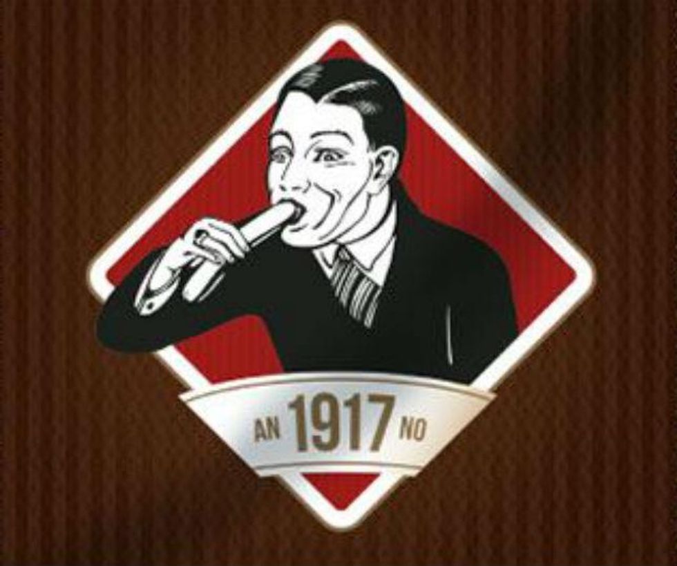
17. Kostelecké Uzeniny sausages
Top 100
The Conversation (0)
