


The Conversation (0)
Louis Dor
Nov 08, 2016
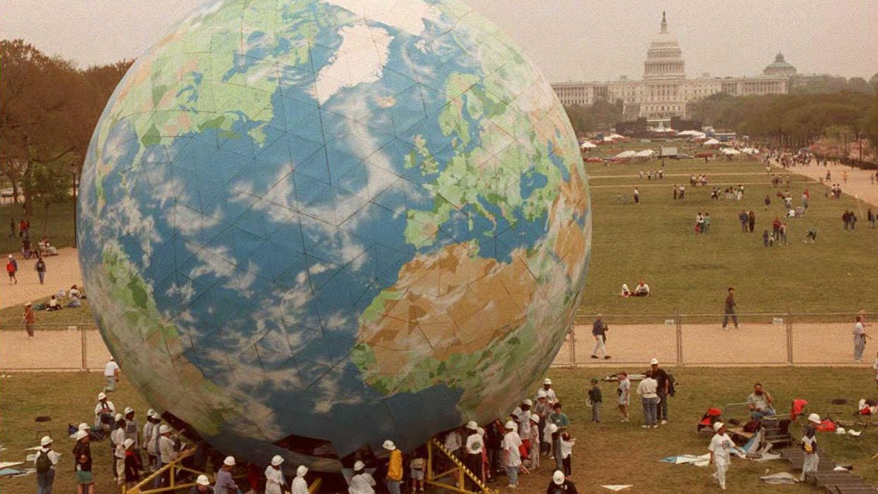
Earth Day was celebrated for the first time in 1970
AFP/Getty
Maps are a wonderful way of informing our world perspective.
By dividing topics into geographic boundaries you can see the world through a filter, helpfully giving you a snapshot of an issue around an area - for example mass shootings in the US.
However, maps can also limit our perspective - for example we learn little of population by comparing relative size of countries.
Compare Singapore with Alaska and you'll see the point.
To solve this problem, a few people on one of our favourite subreddits have been posting maps of countries and regions divided by equal populations.
They're fascinating - let us know your favourite in the comments, below:
Mongolia (in two parts):
Estonia (in three parts):
Russia (in three parts):
Netherlands (in three parts):
Norway (in three parts):
Romania (in three parts):
Canada (in three parts):
Brazil (in three parts):
Italy (in three parts):
Finland (in three parts):
Germany (in three parts):
Chile (in three parts):
Spain (in three parts):
New Zealand (in three parts):
Dominican Republic (in three parts):
Europe (in three parts):
Malaysia (in three parts):
South Africa and Namibia (in three parts):
Africa (in four parts):
Lithuania (in three parts):
Belgium (in three parts):
Australia (in three parts):
Sweden (in two parts):
BONUS: The world (in 10 parts):
HT Reddit
Top 100