Viral
Evan Bartlett
Jul 02, 2015
Since publishing our original list of the 10 worst logos ever designed, it has come to our attention that many fine/awful examples missed the cut.
With that in mind, here are 15 more of the worst logos ever designed (and yes, many of them do look like penises):
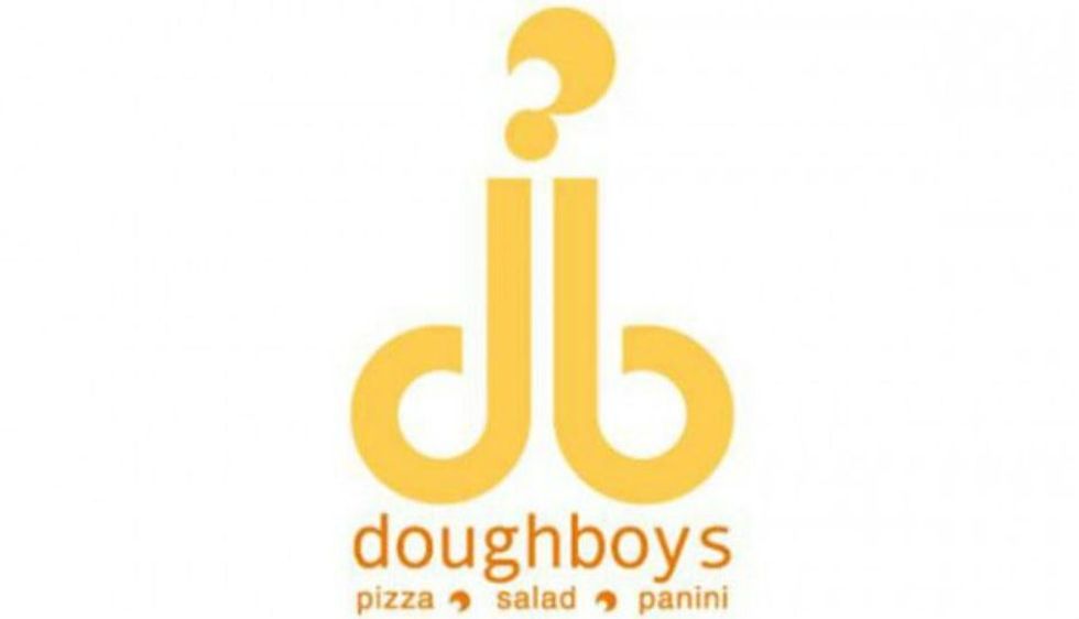
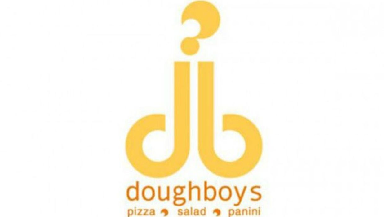
1. Doughboys
Never order the "Chef's Special".
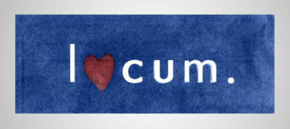
2. Locum
A capital 'L' would surely have saved their blushes.
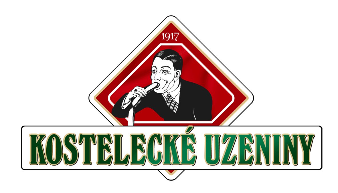
3. Kostelecké uzeniny
These sausages are so good this man's trying to swallow them whole.
4. Taylor Pork Roll
These "pork rolls", whatever they are, don't look quite so tasty however.
5. Clinica Dental
Why not use some teeth? Or at least a chair for some context?!
6. The Computer Doctors
Someone call the logo doctors, amirite?
7. Ladd Air Force Base
The Alaskan Cold Weather Test Detach unit is coming for you with polar bears, cartoon rockets and rainbow explosions!
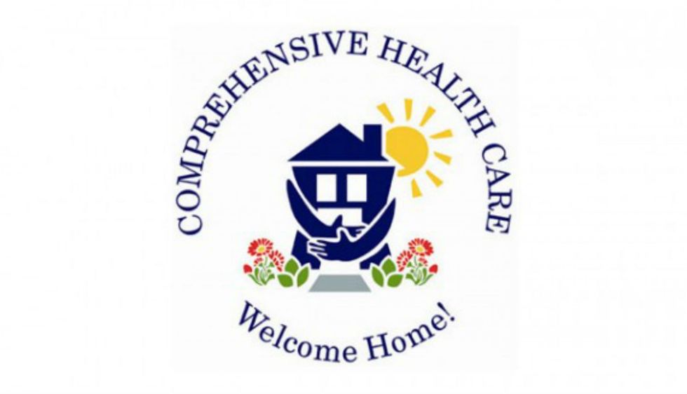
8. Comprehensive Health Care
"Hey, hey, I'm getting changed!"
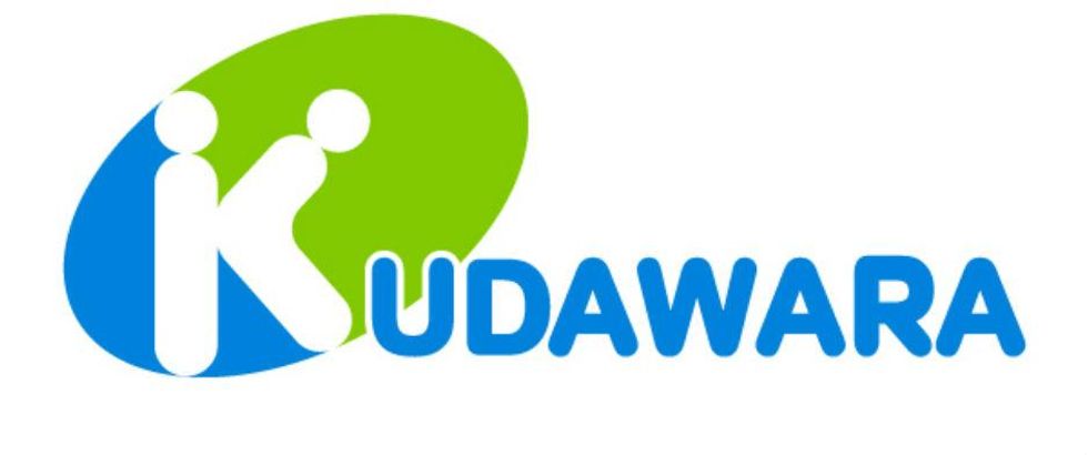
9. Kudawara
Kudawara: The pharmacy with an accidentally suggestive logo.
10. Bureau of Health Promotion
Bureau of Health Promotion: The bureau of health promotion with an accidentally suggestive logo.
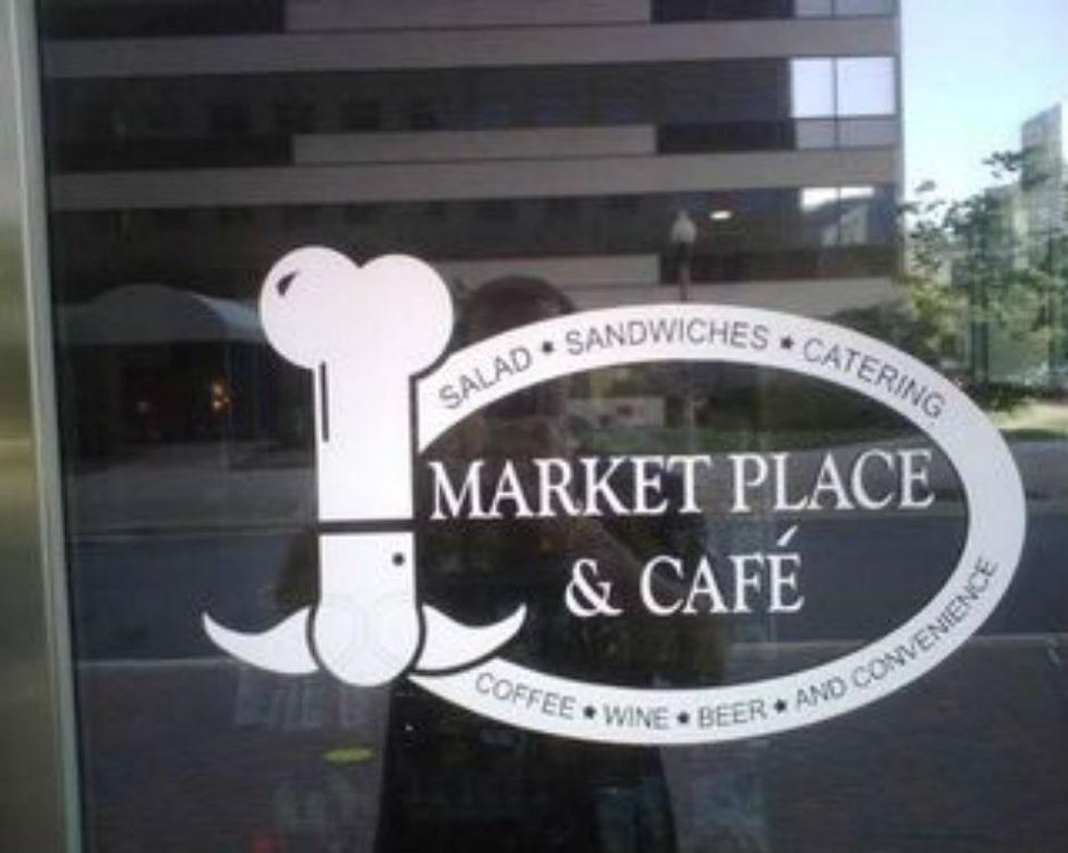
11. Market Place and Cafe
Definitely just a chef with a long nose and a moustache. Definitely.
12. Royal New Zealand Air Force
Ok so there's nothing aesthetically bad about this but when you consider the RNZAF has these roundels on the side of its planes, it turns it into probably the least scary air force in the world.
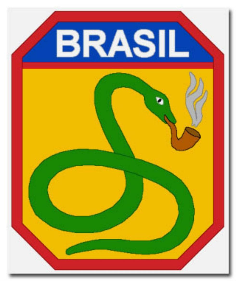
13. Brazilian Expeditionary Force
In another bizarre military logo, as inspired by this list from Cracked, what on earth is going on with this pipe-smoking snake? (It appears to be something to do with a Portuguese-language version of a flying pig. Yes, we're still confused).
14. Baby change facilities
Presented without comment.
15. Spetsnaz
This lynx on a badge used by one of the Soviet army's Spetsnaz special forces units looks a little bit like this shocked cat gif.
Top 100
The Conversation (0)
