There are no two ways about it, when Brexit actually happens on 31 January, freedom of movement for UK citizens within the European Union will change.
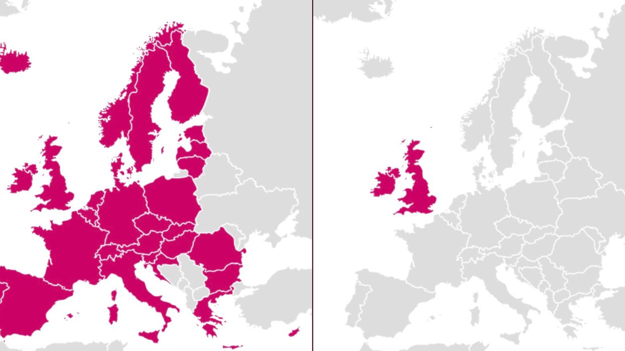
The harsh reality of this restriction has been captured in these two charts, and shared to Twitter by former Labour MEP, Seb Dance.
Taking to the social media platform, he wrote:
"Ending free movement.
On the left: your current free zone.
You can work, travel, study, love, retire across this area.
No visas. Includes non-EU members.
On the right: your future free zone (assuming CTA with Ireland).
Can *anyone* explain how this is increasing opportunity?"
The two charts sum up the difference in a stark, obvious way.
In the first, the pink area denoting the current free zone is extensive, and reaches right across from the west of Europe, to the east.
However, in the second, the outlook is starkly less appealing, with only the United Kingdom and the Republic of Ireland in the pink.
People on the social media platform were quick to notice that in the right hand image, the Republic of Ireland is also coloured in. Dance responded that Irish citizens will be much better off.
Others tried to highlight that Brexit doesn't impact trade with Commonwealth partners. But Dance quickly shut them down.
Some shared the real-life impact the loss of freedom of movement will have on their day-to-day lives.
And Dance responded in the only way that's logical.
More: Why Brexit is making the future of fish look so bleak


