The Conversation (0)
News

When people talk about national debt, it's usually in astronomical, intangible figures we can't relate to.
For example, in Q1 2015, UK government debt amounted to roughly £1.56 trillion.
Here's a chart.
It's all a bit scary and out of perspective, isn't it?
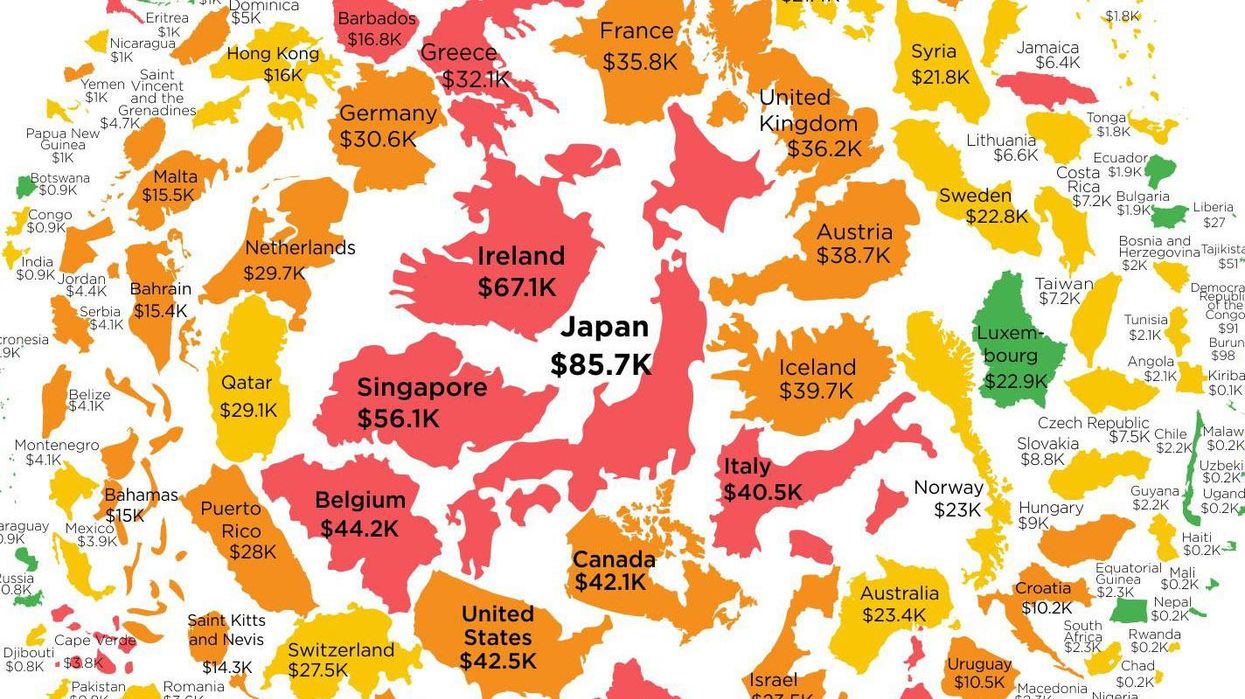
HowMuch.net, a cost information website, has sought to put the numbers into perspective, by calculating the amount of debt per capita - scaling the map in terms of debt per person.
In addition, they've colour coded it to show the percentage of GDP that the national debt makes.
It's a clever little graphic, huh?
The countries who owe the most per person were as follows:
That's us in tenth.
Eep.
More: A map showing the debt of countries around the world compared to their GDP