Famous brand logos are comforting in their capitalistic familiarity. But what if there’s a layer of meaning to them that you’ve completely missed?
Here are some hidden meanings to nine well-known brands:
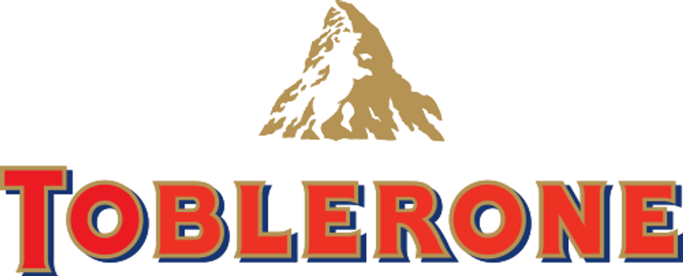
1. Toblerone
While most seasoned logo-discoverers might already know that the mountain is the summit of Matterhorn, which represents its Swiss heritage, what you may not recognise is the bear hidden in the mountainside.
The bear is found on the coat of arms of Toblerone’s home city of Bern.
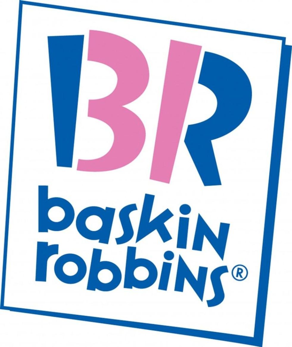
2. Baskin Robbins
There are 31 flavours of ice cream Baskin and Robbins offer. Do you see the pink highlighted bit on the logo? Also 31.
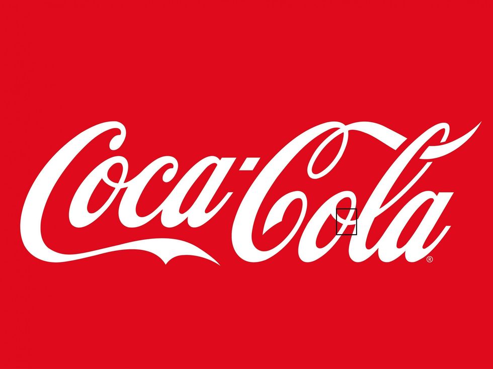
3. Coca Cola
The ‘o’ in Cola is actually the Denmark flag. No, really.
Apparently an unintentional move, when Coca Cola made the discovery they decided to keep it. Denmark has been named the happiest place on earth, so they thought it fit to keep the twirl on the ‘o’.
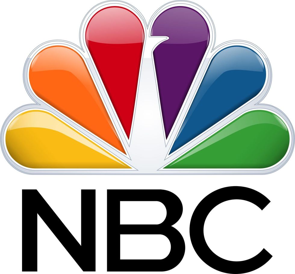
4. NBC
While most people know that the symbol is of a peacock, there’s an interesting story about why there are so many colours. During the 1950s NBC was owned by RCA, which had begun to manufacture colour televisions. In an effort to increase their sales, NBC created the colourful logo to encourage black-and-white TV viewers to switch to colour.
5. Pentagon’s US Cyber Command Logo
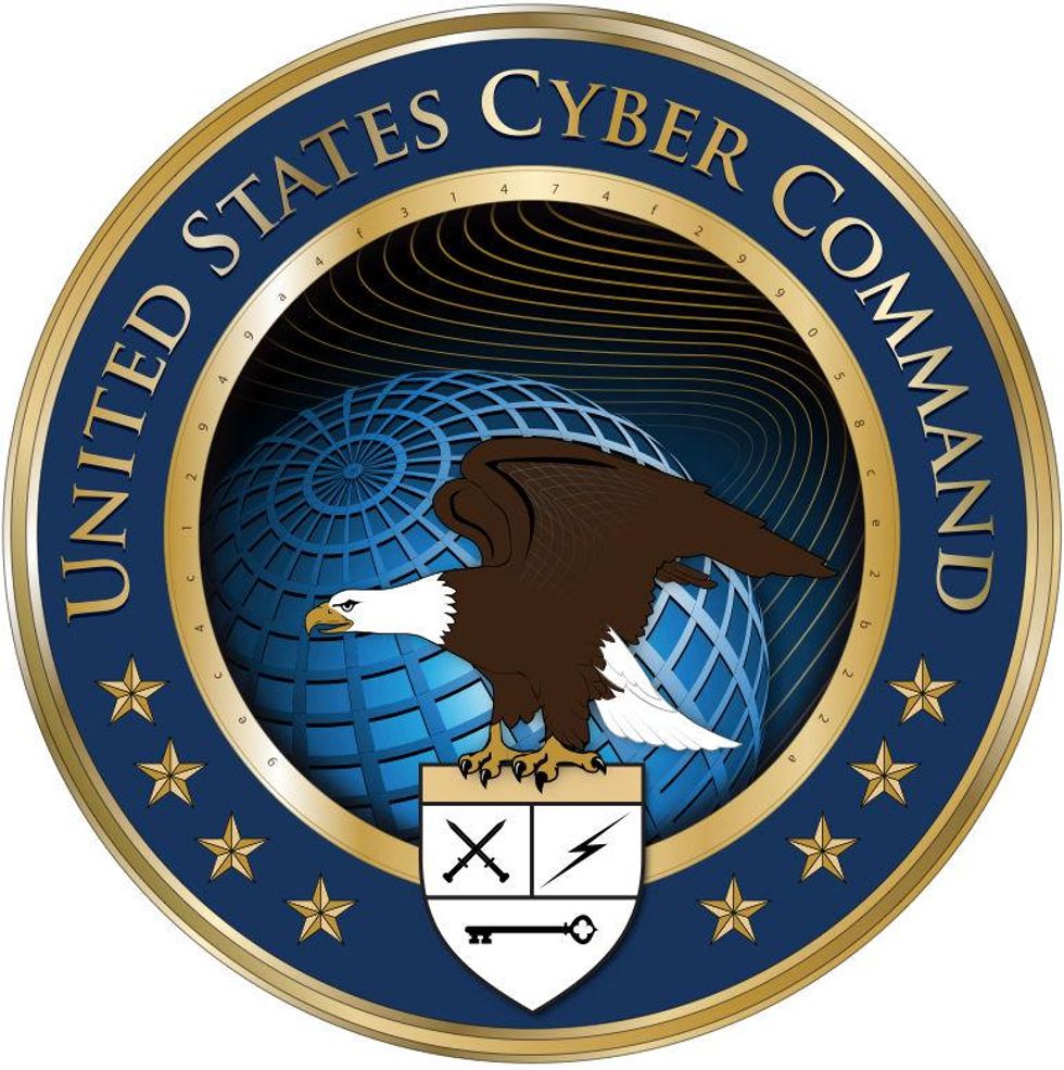
While the American eagle, globe and stars make it look like other US government logos, the inner golden ring with 32 seemingly random numbers marks it as different.
The 32 characters are actually part of a string of code, which read out the US Cyber Command's paragraph-long mission statement encrypted in MD5 hash code:
USCYBERCOM plans, coordinates, integrates, synchronizes and conducts activities to: direct the operations and defense of specified Department of Defense information networks and; prepare to, and when directed, conduct full spectrum military cyberspace operations in order to enable actions in all domains, ensure US/Allied freedom of action in cyberspace and deny the same to our adversaries.
6. The Bronx Zoo
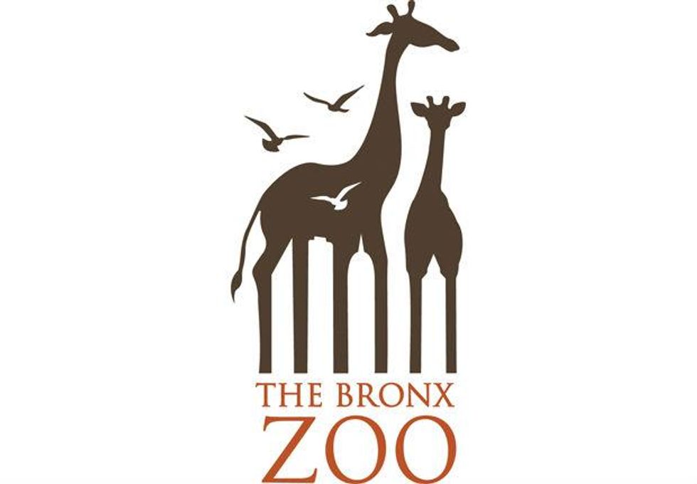
There are giraffes and birds in the logo, but what you might not have noticed is the space between the giraffe’s legs: it’s the New York cityline.
7. BMW
The white parts represent a moving propeller and the blue sections, the sky. Why? BMW Roundel has roots in aviation, all the way back to its founding in 1916, and the logo pays homage to the history.
8. Amazon
The logo meanings are especially clever because they are twofold: not only is the arrow a part of a smiley face, but it goes from A to Z, much like their deliveries.
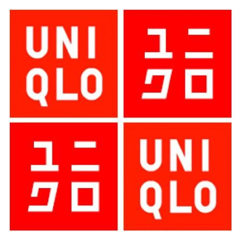
9. Uniqlo
The red and white colouring of the logo was chosen for two reasons: first, those are the colours of the Japanese flag, and the designer wanted to evoke the country in the design. The second, interestingly, is that by including katakana, in addition to the colouring, the logo brings to mind a Japanese ink seal.
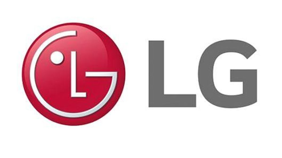
10. LG
The pink part of the LG logo is a winking face. However, as some people have pointed out, the logo also looks like a modified Pac-Man.
More: Ten of the worst logos to ever be designed
More: The 17 most awkward logo designs of all time
