In the UK we tend to measure our height in feet and inches, our beer in pints and our distances in kilometres.
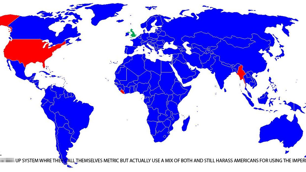
This is of course a random mix of imperial and metric measurement, something Reddit user Tyler1492 has helpfully illustrated.
Sharing a map of the world, they highlighted which countries use the metric system in blue, and the ones that use imperial in red.
The UK is highlighted separately in green along with the following description:
Crazy, f***** up system where they call themselves metric but actually still use both and still harass Americans for using the imperial system
As you can see, there are very few countries highlighted in red - that's because the US is the only industrialised country in the world that hasn't officially adopted the metric system.
Which may go some way to explaining the description...
More: This map of Earth is the most accurate ever produced, and it looks completely different
More: This map shows what every country in the world is best at doing


